William Savage’s Practical hints on decorative printing (1822)
From the early 19th century, Koenig & Bauer’s new steam-powered double-cylinder printing press, capable of printing over 1100 sheets an hour, disseminated information fast. The circulation of The Times newspaper increased from 5,000 to 50,000 by the middle of the century. However, not all printing was about speed – in 1822 William Savage published his guide to fine art printmaking – still a popular art form today.

William Savage (1770–1843) was the son of a Yorkshire bell- and clock-maker. In 1790 he went into the printing and bookselling business with his older brother, James (1767-1845), before moving to London in 1797; James followed in 1803.
James Savage joined the publishing firm of Richard Phillips (and later of Joseph Mawman and William Sherwood) and in 1806 became Assistant Librarian of the brand-new London Institution, founded to ‘promote the diffusion of Science, Literature and the Arts’. In addition to its library of ‘Works of Intrinsic Value’, the Institution offered its members reading rooms ‘for the Daily Papers, Periodical Publications, interesting Pamphlets, and Foreign Journals’ and held lectures ‘for the Diffusion of Useful Knowledge’. (How familiar it all sounds to those of us who support the Devon and Exeter Institution!) James eventually became Librarian of the Somerset and Taunton Institution and then editor of the Dorset County Chronicle.

In the meantime, William Savage started his own printing business in Bedfordbury, Covent Garden. Within a few years he was appointed printer to the new Royal Institution, founded in March 1799 to introduce science and technology to the public. He made his reputation printing Edward Foster’s British Gallery of Engravings in 1807 and later won a medal from the Society for the Encouragement of Arts for his invention of an oil-free printing ink.
In 1822 William Savage published what he described as ‘perhaps, the first attempt to diffuse a general knowledge of the improvements that have taken place in the art of printing’: Practical Hints on Decorative Printing, with Illustrations Engraved on Wood, and Printed in Colours at the Type Press. Savage begins with the origins of printing and goes on to offer a practical guide to fine presswork, to materials, including the best papers, inks and woodblocks, to the various tints used in colour wood-engraving (or chromoxylography) and, of course, to the latest printing machines. While his brother sought to diffuse the study of science, literature and the arts as a librarian at the London Institution, William pursued ‘the increase and diffusion of knowledge, by means of Printing’.
Savage was a fine art printer and an expert in printing both letterpress and wood-engraved colour plates. Chromoxylography was one of the most popular forms of colour printing in the first half of the 19th century; it was simple yet could achieve sophisticated and highly decorative results.
In monochrome wood-engraving, an engraver cuts an image onto the end of a hard block of wood, usually box wood, using a sharp tool called a burin; the image is cut in relief – i.e. the lines and areas to be printed sit proud on the surface of the block (like a child’s potato print) while the areas that are cut away form the white, non-printed parts of the image. The woodblock is then rolled with ink across the surface and pressed onto a sheet of paper.
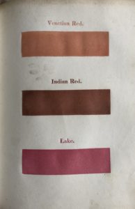
In colour wood-engraving, the engraver must study the artist’s original drawing carefully to decide which colours to use to reproduce the image. In the 19th century, cheap publications used only two or three primary colours but the colour plates in expensive publications, for example those depicting natural history or fine art paintings, could be produced from many woodblocks, usually one for each colour – great skill is required to print each colour woodblock in register to ensure the finished image is sharp.
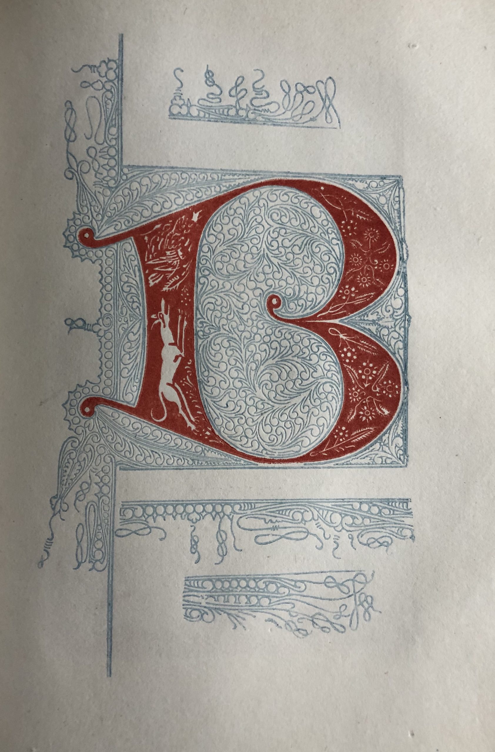
In his Practical Hints on Decorative Printing, William Savage includes an image of the initial B in Johann Fust’s and Peter Schoeffer’s Psalter of 1457, known as the Mainz Psalter. This was the second major book to be printed with movable type in the West and the first to include printed decorative initials. Of all the initials in a Psalter, the Beatus initial is the most important; it is the opening word of Psalm 1, ‘Beatus vir’, or ‘Blessed is the man…’. In the Mainz Psalter, the initials are printed from just two colour blocks, sometimes red letters placed within a blue ornamental design or blue letters placed within a red ornamental design. Despite the limited colours in the Mainz Psalter, Savage marvels at the precision of its printing:
In turning the volume over at a table, I could not help admiring the great accuracy with which the workmanship was executed, in inserting a large capital letter into the surrounding ornamental part, where the exact shape is bounded by a fine line of a different colour, so near to each other, as to be separate by a space not more than the thickness of writing paper, and uniformly true in every instance.
Indeed, he believed that several works printed in the 15th century,
both in the quality of the ink, and in the workmanship, are so excellent, that it would require all the skill of our best printers, even at the present day, to surpass them in all respects … and as to the inserting of a great number of single capital letters in their proper places in a sheet, with a degree of accuracy, and sharpness of impression, that I have never seen equalled in modern workmanship.
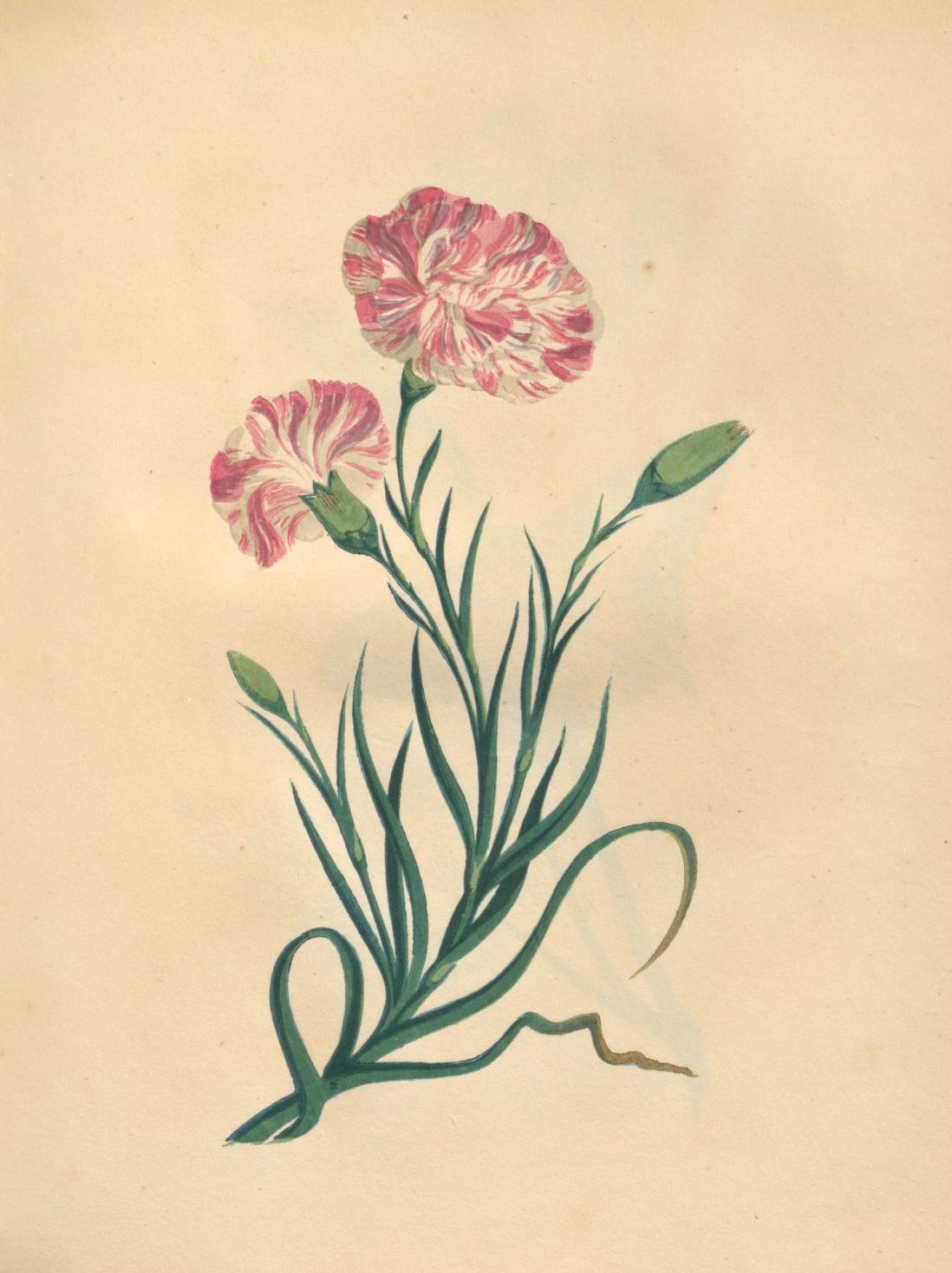
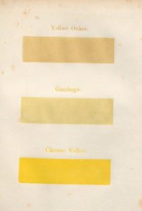
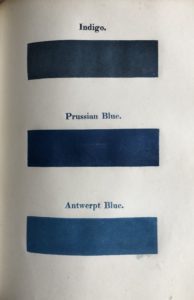
In the appendix to his book Savage includes examples of exquisite fine art printing and identifies the individual colours used to create the images. The carnation, drawn by J. P. Neale and engraved by H. White, is printed with seven woodblocks, including Carmine and a purple made from Prussian Blue and Lake for the flower, a dark green made from Prussian Blue and Chrome Yellow for the stalks and leaves and a light green made from Antwerpt Blue and Chrome Yellow.
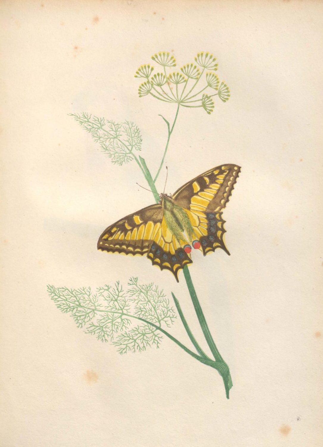
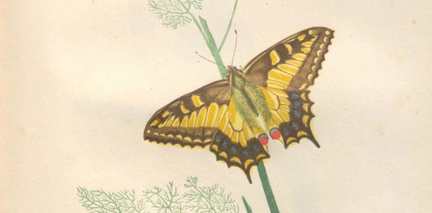
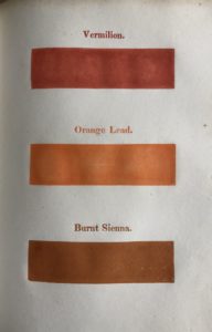
The butterfly and fennel, drawn by J. P. Neale and engraved by Branston, is also printed with seven blocks, including black, a brown made from Burnt Sienna, Rose Pink and Indian Red, the light yellow of the wings from Chrome Yellow, the dark yellow from Indian Yellow and the fennel plant from a blend of Antwerpt Blue, Prussian Blue and Chrome Yellow.
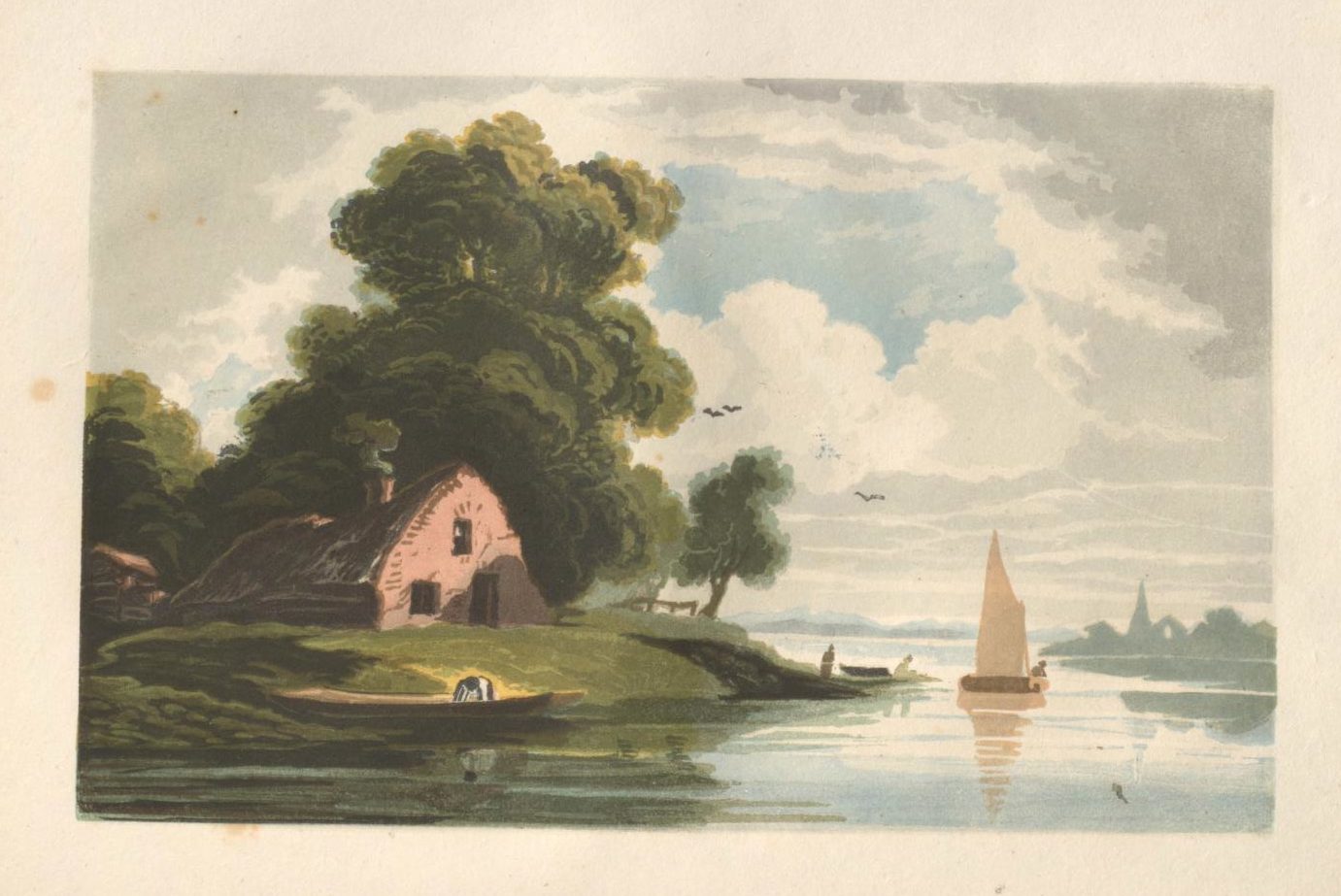
The cottage, drawn by J. Varley and engraved by J. Thompson, is printed with 14 woodblocks:
It commenced with printing the clouds, which are the Neutral Tint; then the blue sky, with Antwerpt Blue, and advanced progressively to the darkest shades: the trees were glazed with green after the deepest parts were printed.

The magnificent illustration to Collins’s Ode on Mercy, painted by W. H. Brooke and engraved by G. W. Bonner, is printed in 29 blocks – ‘the most complex subject that was ever produced at the Type Press’.
Wood-engraving remains a popular art form. In the 20th century it was championed by prominent artists, including Paul Nash, Eric Gill, Eric Ravilious, Lucien Pissarro, M C Escher and Henry Moore. In March this year the Society of Wood Engravers celebrated its centenary with an exhibition in William Savage’s home county of Yorkshire.
Emma Laws, Director of Collections and Research
The full text of William Savage’s Practical Hints on Decorative Printing, with Illustrations Engraved on Wood, and Printed in Colours at the Type Press (1822) is available online here